Project Details

Every pixel tells a story, every line of code gives it life.
Logo Design
Sharp Feather Logo Design
Date:
Jan 2026
Client :
Alex Dane
Project Duration :
4 Weeks
Design Vision
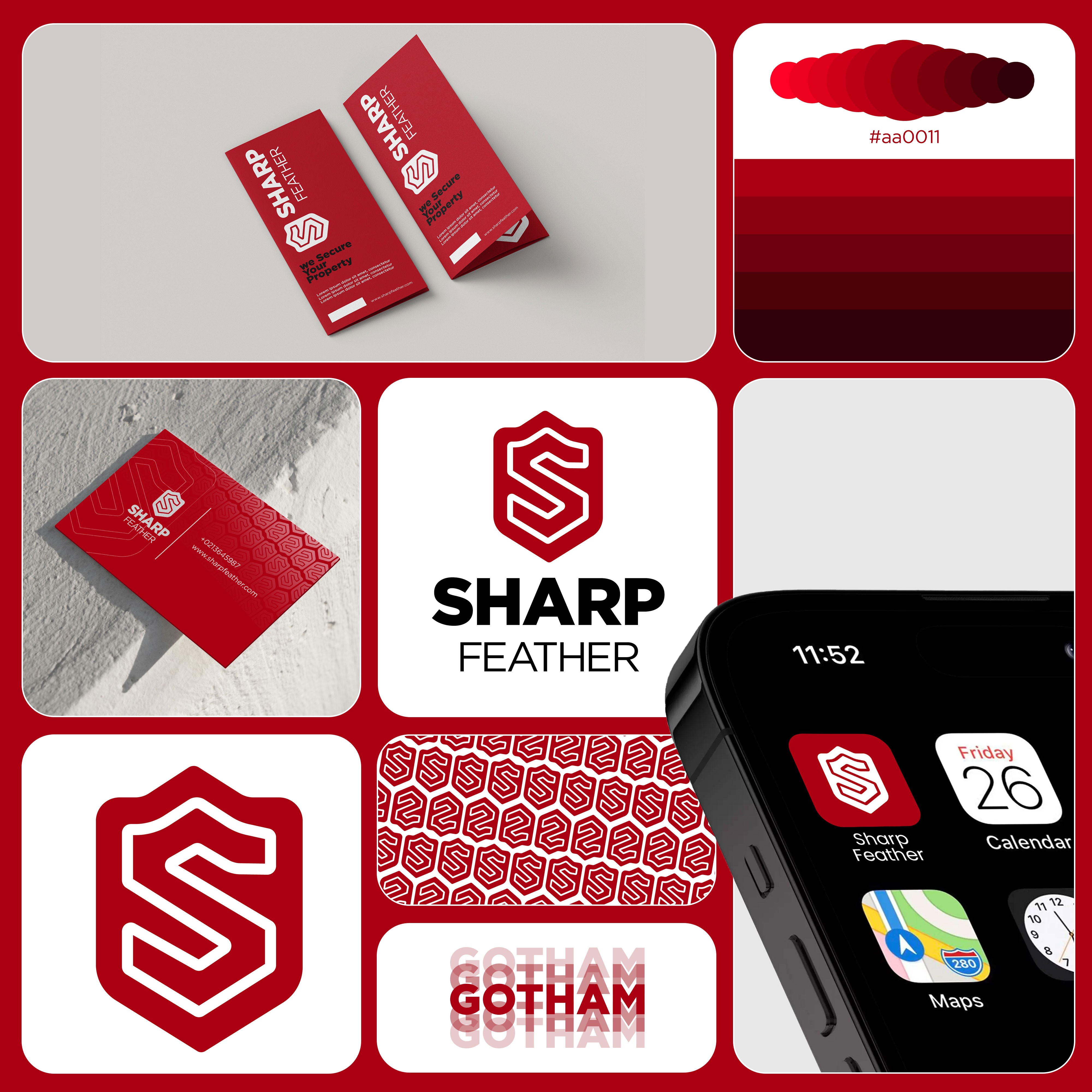
Sharp Feather is a bold security brand identity built around trust, protection, and vigilance. The logo combines a shield silhouette with an interlocking "S" monogram, symbolizing safety and strength. Paired with a deep red color palette and the Gotham typeface, the identity conveys authority and reliability — extending seamlessly across business cards, app icons, patterns, and digital platforms.
The Sharp Feather identity is rooted in the idea of protection — visually represented through a shield form, the universal symbol of security and defense. The interlocking "S" within the shield reinforces strength and continuity, suggesting an unbroken line of defense around the client's property.
A bold red (#aa0011) was chosen as the primary brand color to evoke alertness, urgency, and confidence — qualities essential to a security brand. The Gotham typeface adds a clean, authoritative voice to the wordmark, balancing the boldness of the icon with structured, professional typography.
The brand system was designed to feel modern and tech-forward, not just traditional "guard company" branding — making it equally suitable for physical security services and digital/app-based security platforms.
Design Process
01. Research & Discovery
Studied the security industry's visual language — shields, locks, badges — to identify common clichés and find a more distinctive, modern direction for Sharp Feather.
02. Concept Development
Explored multiple icon directions (locks, eyes, badges) before settling on a shield + "S" monogram — combining a literal security symbol with a custom brand-specific letterform.
03. Sketching & Iteration
Refined the "S" shape within the shield outline, testing stroke weight and negative space until the mark read clearly as both an "S" and a self-contained shield icon.
04. Typography Selection
Selected Gotham for its strong, structured letterforms — pairing a bold "SHARP" with a lighter-weight "FEATHER" to create visual hierarchy within the wordmark.
05. Color Palette Development
Built a tonal red gradient system (#aa0011 and shades) to give the brand depth and flexibility across different applications — from flat print to gradient digital UI.
06. Pattern Design
Extracted the shield/S icon into a repeating geometric pattern, creating a secondary brand asset usable across packaging, backgrounds, and print collateral.
07. Mockup & Application Testing
Applied the identity across real-world touchpoints — business cards, brochures, app icon, and mobile UI — to test legibility and brand consistency at every scale.
08. Final Refinement
Polished spacing, contrast, and color consistency across all assets to deliver a cohesive, production-ready brand system.
Process included:
Brand Research & Competitor Analysis
Concept Sketching & Ideation
Logo Construction (Shield + Monogram)
Typography Selection & Pairing
Color Palette & Gradient System
Pattern Design (Icon-Based)
Mockup Application (Print, App, Stationery)
Final Brand Presentation

Design Outcome
A strong, memorable shield + monogram mark suited for a security brand
A bold red identity system that conveys trust, alertness, and authority
A scalable logo that works as a full lockup or standalone app icon
A custom pattern system extending brand recognition beyond the logo
A cohesive identity tested across print, digital, and mobile applications
A production-ready brand system, professional and modern in execution
Outcome highlights:
Distinctive shield + "S" monogram — instantly recognizable as a security mark
Bold, confident color palette built for trust and visibility
Seamless scalability — from business cards to app icon to signage
Custom pattern system reinforcing brand identity across collateral
Clean, production-ready system ready for real-world deployment