Project Details
Every pixel tells a story, every line of code gives it life.
Logo Design
Up Hexagon Logo
Date: Dec 2023
Mar 2026
Client : Daniel
Up Hexagon
Project Duration :
2 Weeks

Design Vision
UP HEXAGON — Design Vision
Concept
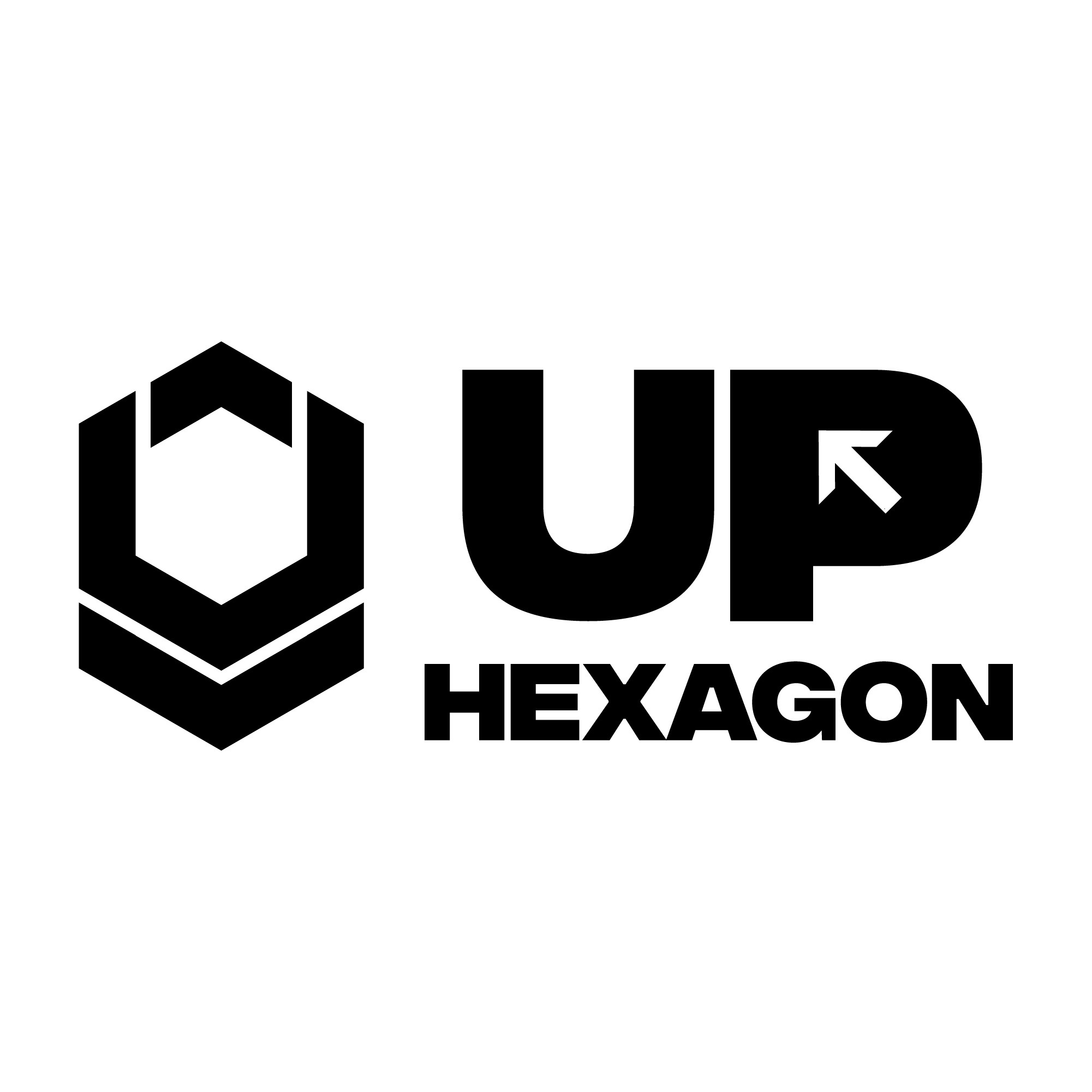
The UP HEXAGON identity is built around movement and elevation — the upward arrow integrated into the "P" symbolizes growth, progress, and forward momentum, while the hexagonal mark reflects strength, structure, and modularity. Together they form a bold, masculine identity suited for an athletic or performance-driven brand.
Logo Mark
The hexagon icon is constructed from interlocking geometric facets, creating a sense of depth and dimension even in flat black-and-white form. Its layered chevron structure suggests stacking, ascension, and built-up strength — mirroring the brand's "UP" philosophy.
Typography
A heavy, condensed sans-serif typeface (Fontspring) was chosen for maximum impact and legibility at scale — from large vehicle wraps to small garment tags. The bold weight reinforces confidence and authority, while tight letter-spacing keeps the wordmark compact and modern.
Color Palette
A strict monochrome palette (black, white, and greyscale gradients) was used to keep the brand versatile, premium, and timeless — allowing it to adapt seamlessly across apparel, packaging, vehicle branding, and digital platforms without losing visual consistency.
Pattern System
A repeating hexagonal pattern, derived directly from the logomark, was developed as a secondary brand asset — used as a textile print and surface pattern to extend brand recognition beyond the primary logo, especially across apparel and packaging.
Brand Applications
The identity was tested across real-world touchpoints — vehicle livery, retail shopping bags, and apparel (sweatshirts, joggers) — to ensure the mark holds strength and clarity at every scale, from a small embroidered tag to a full van wrap.
Overall Direction
UP HEXAGON's visual identity communicates strength, structure, and ascension — a brand built for movement, designed to perform as confidently on the street as it does on a delivery fleet.

Design Process
UP HEXAGON — Design Process
01. Research & Discovery
Began by understanding the brand's core identity — a performance and lifestyle-driven name built around motion, ascension, and modern strength. Researched competitor marks in the athletic/streetwear space to identify gaps and find a distinct visual direction.
02. Concept Development
Explored multiple directions around the "UP" theme — arrows, mountains, ascending bars — before settling on a hexagonal structure that could double as a geometric "U" form. This allowed the mark to feel both literal (upward arrow) and abstract (hexagon/shield shape).
03. Sketching & Iteration
Hand-sketched several hexagon variations, testing how the arrow could integrate naturally into the "P" of the wordmark without compromising legibility. Refined proportions until the mark felt balanced as a standalone icon and alongside the typography.
04. Typography Selection
Tested multiple bold, condensed typefaces before selecting Fontspring for its strong geometric structure — ensuring the wordmark matched the weight and confidence of the icon.
05. Grid & Construction
Built the hexagon icon on a strict geometric grid to maintain consistent angles and proportions, ensuring the mark scales cleanly from a small tag to a large vehicle wrap without distortion.
06. Color & Pattern Exploration
Locked the palette to monochrome (black/white/grey) for maximum versatility. Extracted the hexagon shape into a repeating pattern system to extend the identity into a recognizable secondary brand asset.
07. Mockup & Application Testing
Applied the finished identity across real-world brand touchpoints — vehicle livery, packaging bags, apparel (sweatshirts, joggers) — to test legibility, scalability, and overall brand presence in real environments.
08. Final Refinement
Fine-tuned spacing, contrast, and icon-to-text ratio across all applications to ensure a cohesive, production-ready identity system.
Process included:
Brand Research & Competitor Analysis
Concept Sketching & Ideation
Logo Construction & Grid System
Typography Selection & Pairing
Color Palette Development
Pattern Design (Hexagon System)
Mockup Application (Vehicle, Apparel, Packaging)
Final Brand Presentation

Design Outcome
UP HEXAGON is a bold, performance-driven brand identity built around the concept of upward movement and strength. The logo combines a geometric hexagon mark with an integrated upward arrow, symbolizing growth, progress, and ascension. Designed with a strict monochrome palette for maximum versatility, the identity extends seamlessly across apparel, packaging, vehicle branding, and digital platforms — creating a strong, consistent brand presence across every touchpoint.
Outcome highlights:
Versatile monochrome identity adaptable across any industry or application
Strong brand recall through a custom geometric hexagon mark
Seamless scalability — from small garment tags to full vehicle wraps
Custom pattern system extending brand recognition beyond the logo
Cohesive, production-ready brand system tested across real-world mockups